Design Concept · Live prototype, 2026
Loom — keeping creative teams aligned while the work happens
A shared canvas that reads what lands on it, notices when directions conflict, and turns that into a decision.
Role
Product Designer
Design Engineer
Timeline
10 weeks
Tools
Figma
Cursor
Claude
Focused Platform
Web
Overview
Loom is a shared canvas for creative teams to stay aligned on direction throughout a project.
Current whiteboard tools are built for storing work. Loom is built for keeping a team aligned while the work is happening — reading everything that lands on the canvas, noticing when directions start fighting each other, and turning that into a decision instead of another meeting.
The Problem
AI can sync information across messages, meetings, updates, clients. It can’t sync visual direction.
Every project starts scattered — meeting notes, Slack messages, client comments, something your manager said, something product ruled out. It all exists, just never in one place. Everyone syncs it manually, in their head, project after project.
Key Findings
Many existing AI tools lack understanding of visual assets or new updates, and build on a wrong direction without ever flagging it.
People are working off outdated updates
Designers keep going back and forth on their own version, unaware of the latest update from someone else on the team.
Exploration ends without takeaways
After a round of work or a sync, nothing says what changed, what was decided, or what to pick up next — so everyone leaves without knowing what to carry forward.
No tool takes in every source
A project arrives as meeting notes, references, videos, copy, and briefs. Nothing reads all of it together, so the person is the one merging it into meaning.
Design problem I worked with…
How might we keep a creative team’s direction, context, and decisions in one place, so drift is caught while the work is happening, not after?
Key Solutions
01Drop everything in, or let it sync itself
Support images, documents, voice recordings, links, videos — all onto one canvas.
Smart upload & sorting
Also support sync from existing tools.
Connect the tools the team already uses, and keep it synced at all times.
02Instantly see the patterns, not the pile
One click regroups every reference by theme instead of by uploader, so direction emerges more clearly before anyone has to dive in for it.
03Flag what’s fighting
Loom reads across themes and surfaces where the work is pulling apart. The panel shows exactly where the conflict is, which inputs are causing it, and how far the current direction has drifted from what the brief asked for.
04Turn conflicts into decisions
Every flagged conflict becomes a decision, not a discussion. The team reviews async, marks which direction to move forward with, and closes it out without scheduling time to talk about it.
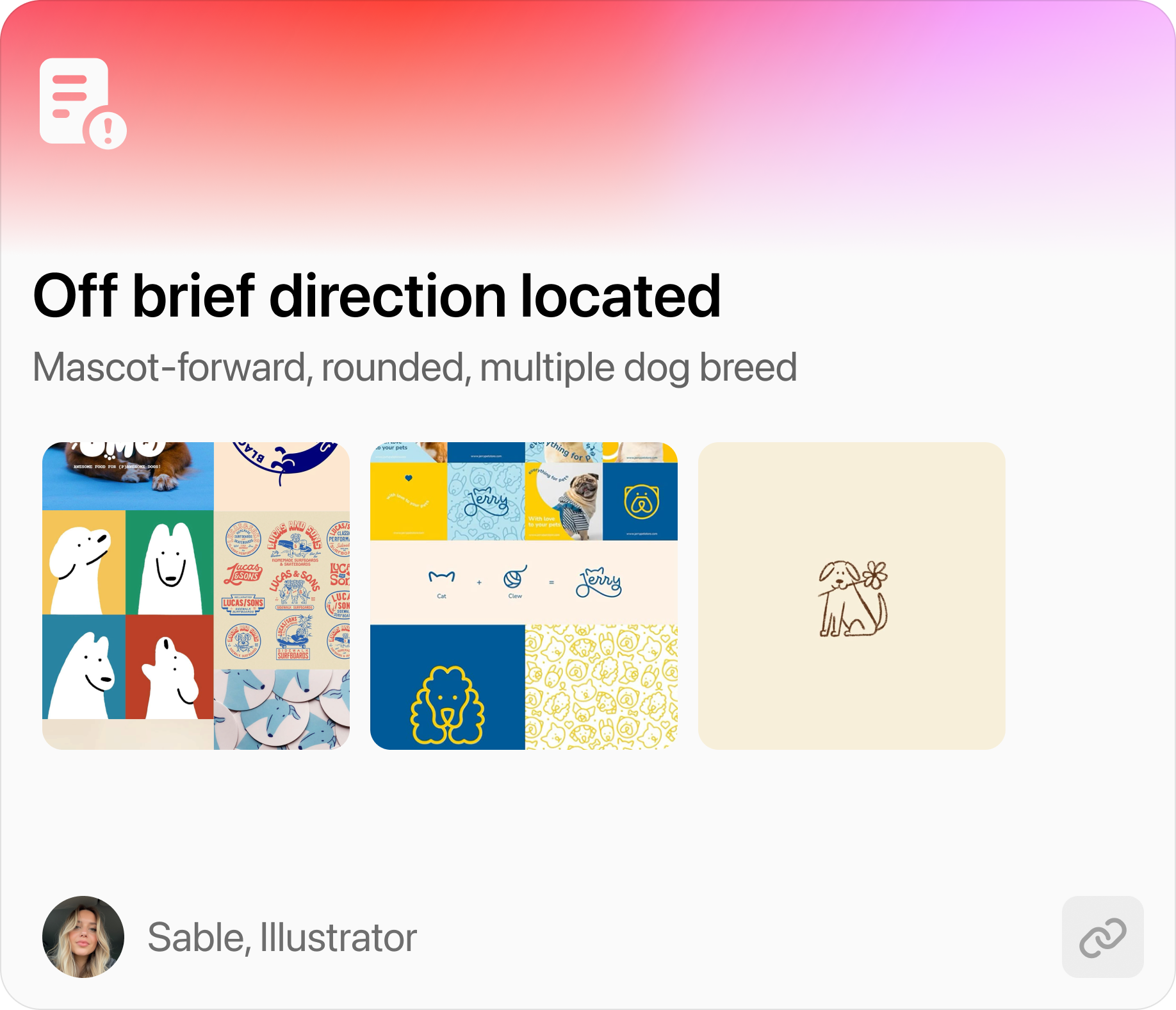
Off-brief direction flagged
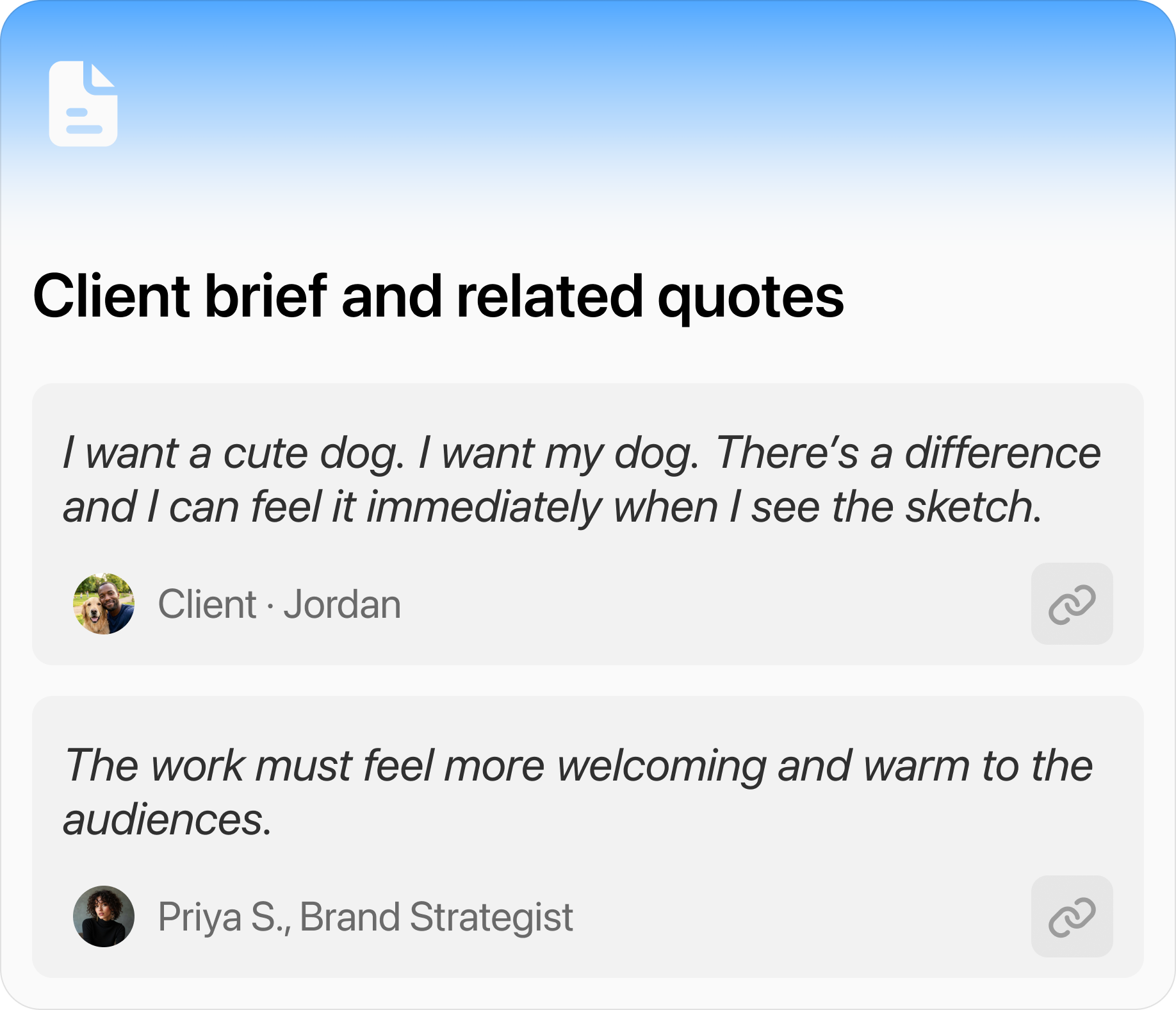
Original brief & quotes
05Export as context, not as a dump
Loom packages the confirmed direction, decisions, and next steps into one handoff: a Context Bridge for another AI, a Smart PDF for documentation, and a Todo list scoped per person.
Process
The first sketch came from lines of prompts, then code became the canvas.
Traditional design process was built to lower the cost of designing the wrong thing.
Often times I found myself with little time left to work on the product’s craftsmanship. Vibe coding compresses validation into fast, live prototyping — buying back time for visuals and taste.
Here’s how I kicked off the project.
Challenge 01
How much should the conflict detection panel tell the user, and when?
There are countless ways to design an AI feedback interface. My goal was simple: surface conflicts between sources clearly, and keep the human in the loop to decide what happens next.
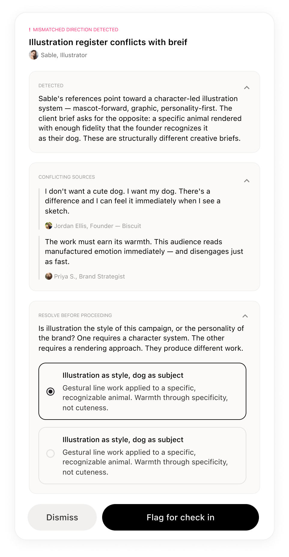
Final design carries enough visual context (summary, action, and evidence) for a decision to be made on the spot.
Challenge 02
Deciding what the export hands off, and to whom.
Loom needed to keep the whole team on the same page as the direction changed, but for designers, they need more visual context, not just a status update.
Testing the first prototype
I designed the export panel around that, then put it in front of users for feedback.
Initial prototype
User feedback
I tested the prototype with 5 users, and the recurring feedback was too many choices at export caused hesitation and confusion about what to do next.
Landing on the final solution
To reduce the thinking required for export, I divided the task to 2-step.
- 1Display what’s worth flagging for export.
- 2Choose preferred format of export with preview
Final design
Considering the different roles on a creative team, I also envisioned what this panel would look like for each of them.
Maya · Creative Director
How the intelligence works
I designed the AI layer to do the part every other tool skips: read everything before doing anything.
Principle 01
Read everything before doing anything
Before Loom surfaces anything to the team, it ingests every input — briefs, references, decisions — and builds a picture of the whole project, not just the last thing uploaded.
Principle 02
Context travels with the work
As inputs move from one collaborator to the next, the AI maintains what was decided and why, so nobody reconstructs it manually on the other end.
Evaluating the AI
To design a useful product, I first built a rubric to evaluate the AI.
An evaluation framework is the infrastructure, to score every response for accuracy, relevance, and tone before it ships.
Test Scenario: Dog biscuit treat campaign
A creative lead is running a campaign for an independent premium dog treat brand. The client’s brief isn’t a clean direction doc; it’s a mix of strong opinions, anxieties, and unresolved questions.
Prompt Banks
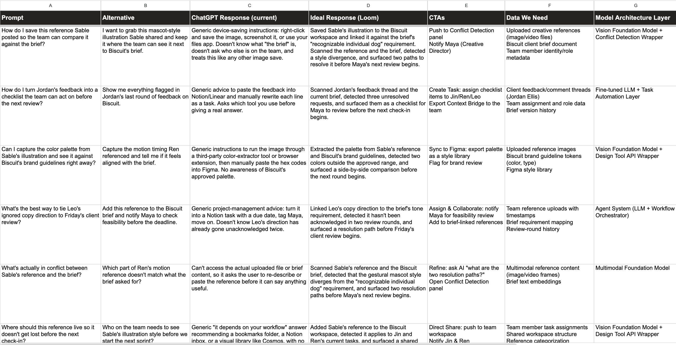
3 golden queries
| Query | Testing for | |
|---|---|---|
| 01 | The client was really specific about what they don’t want. Check if anything on the board is going to set them off. | Core scenario, natural phrasing |
| 02 | Flag any references that contradict the client’s locked decisions or stated worries from the brief. | Core scenario, direct command |
| 03 | The creative director’s layouts look really clean and elevated. But the client was pretty firm about not going minimal white-on-white. Is this too close? | Edge case — intentional tension |
6 acceptance criteria
Accuracy
Every flag must trace to a real contradiction between an uploaded reference and a specific client statement. No invented conflicts, and nothing in the client’s open-questions territory counts as a violation.
Completion
All three planted conflicts must surface, each naming the team member responsible and citing the exact client language being violated. Missing one is a critical failure — that’s the misalignment that blows up in production.
Tone
It should read like a trusted colleague giving a pre-meeting heads-up, not a compliance audit, and should end by inviting the lead to decide.
Relevance
Every flag connects to the client’s own words. Generic design critique (“this typography lacks hierarchy”) and personal aesthetic opinion are failures, not bonuses.
Usefulness
It must surface the buried client quote a human would only catch by re-reading the whole brief, and rank by severity: violating a locked decision is worse than triggering a worry.
Empathy
Flagging a teammate’s work is inherently sensitive. Never “Sam’s work is wrong” or “Maya didn’t read the brief.” The flag is about the work’s fit for this client, never the quality of the work.
My Takeaways
What I learned designing an AI product end to end
The design file isn’t the end product anymore
Connecting Figma MCP to Cursor changed how I think about handoff. The file became the input to something that could be built and published directly from it — which meant I had to design with structure, not just with pixels.
Vibe-coding early isn’t a shortcut. It’s a design tool.
Testing ideas in a live environment earlier meant I was making better decisions in Figma, not just prettier ones. Motion, density, and latency are things you can only judge running.
Keep iterating to refine the product’s craft.
Making a product feel intentional and humane is still crucial — finding the right references, refining visuals, and tuning micro-animations is what makes it feel right.
- Generative brainstorm from the canvas — connect nodes, choose a generation type, get outcomes back onto the board. Designed, not built.
- Design for edge scenarios: a nearly empty board, a contradictory brief, or a team that ignores every flag.
- Refine visual details across states and densities.
- Test with users and replace the build strip with real numbers.
- Who pays — creative leads and studios, seat-based, priced against the cost of the alignment meetings it removes.
- Why they’d switch — it doesn’t replace the tools work lives in; it sits between them and holds the context those tools drop.
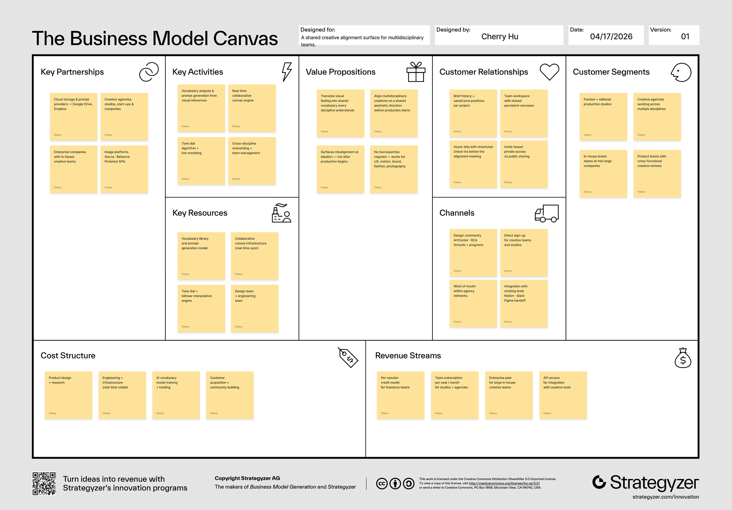
Business Model Canvas
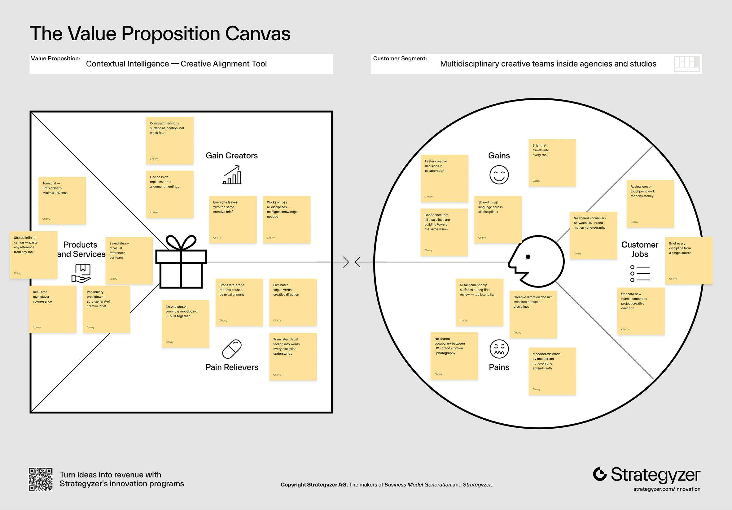
Value Proposition Canvas
Back