Impact
+6.5%
Targeted Demographic Alignment (Gen Z)
20+
Ecosystem integration points into stations
15%
Visitor-to-rider conversion
Background


Powered by Tiktok, Lemon8 is a place where people share authentic takes on beauty, fashion, travel, and food. Less performance, more personality.
6.5% increase in impressions per user, a 6% lift in reads per user, and a 4.5% growth in account follow rate.

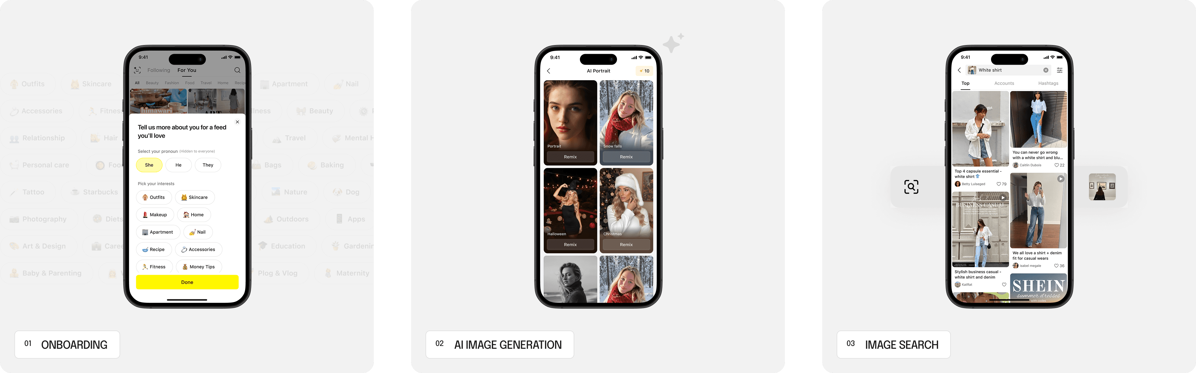
Notes launched in early 2025 as Lemon8's answer to a simple question: What if you don't need to be a creator to share something?
Designed for low-effort share of quick thoughts, daily updates, it gave everyday users a way to participate that felt approachable rather than aspirational.

The Problem

The problem wasn't that people didn't want to share — they did.
But after posting, the silence was loud — low interactions, little feedback, no sense that anyone was actually reading. So they left. And so did the readers, who weren't seeing enough content worth stopping for.
What I found

P0
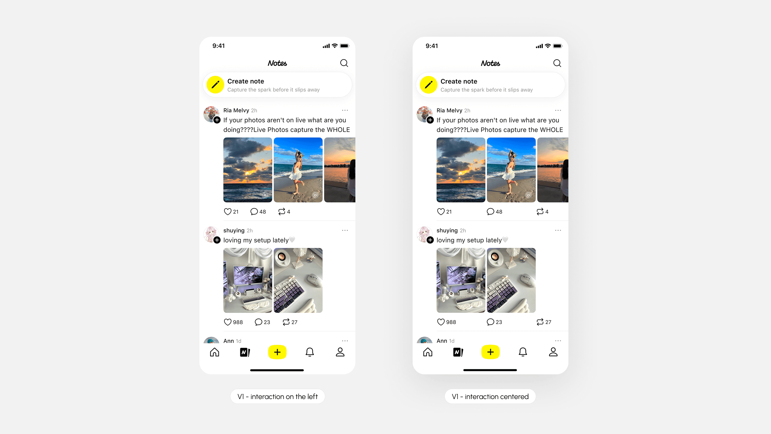
Limited feed content exposure
Only 1.5–2.5 notes per screen, limiting content exposure and slows browsing momentum.

P1
Unclear feed content reading hierarchy
The layout was structured around who posted rather than what they posted.

P2
Images in the detail page were underperforming
When visuals don't feel central to the experience, users skip past them.
design problem i worked with…
Key Solutions
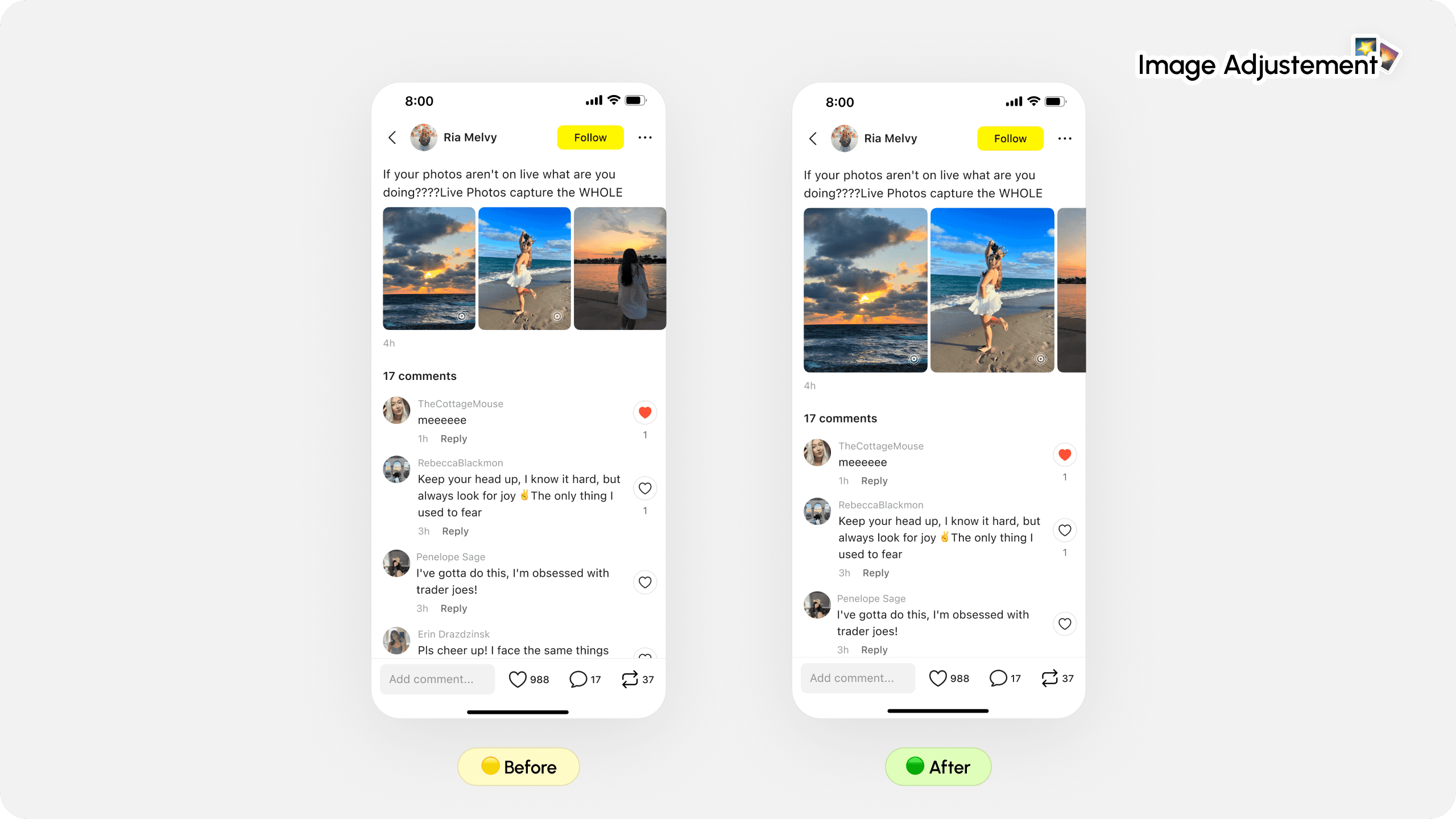
Enlarging the image preview gave Notes more presence on screen — inviting users to look before scrolling past.
Likes and reposts lifted, and overall content engagement moved in a positive direction.
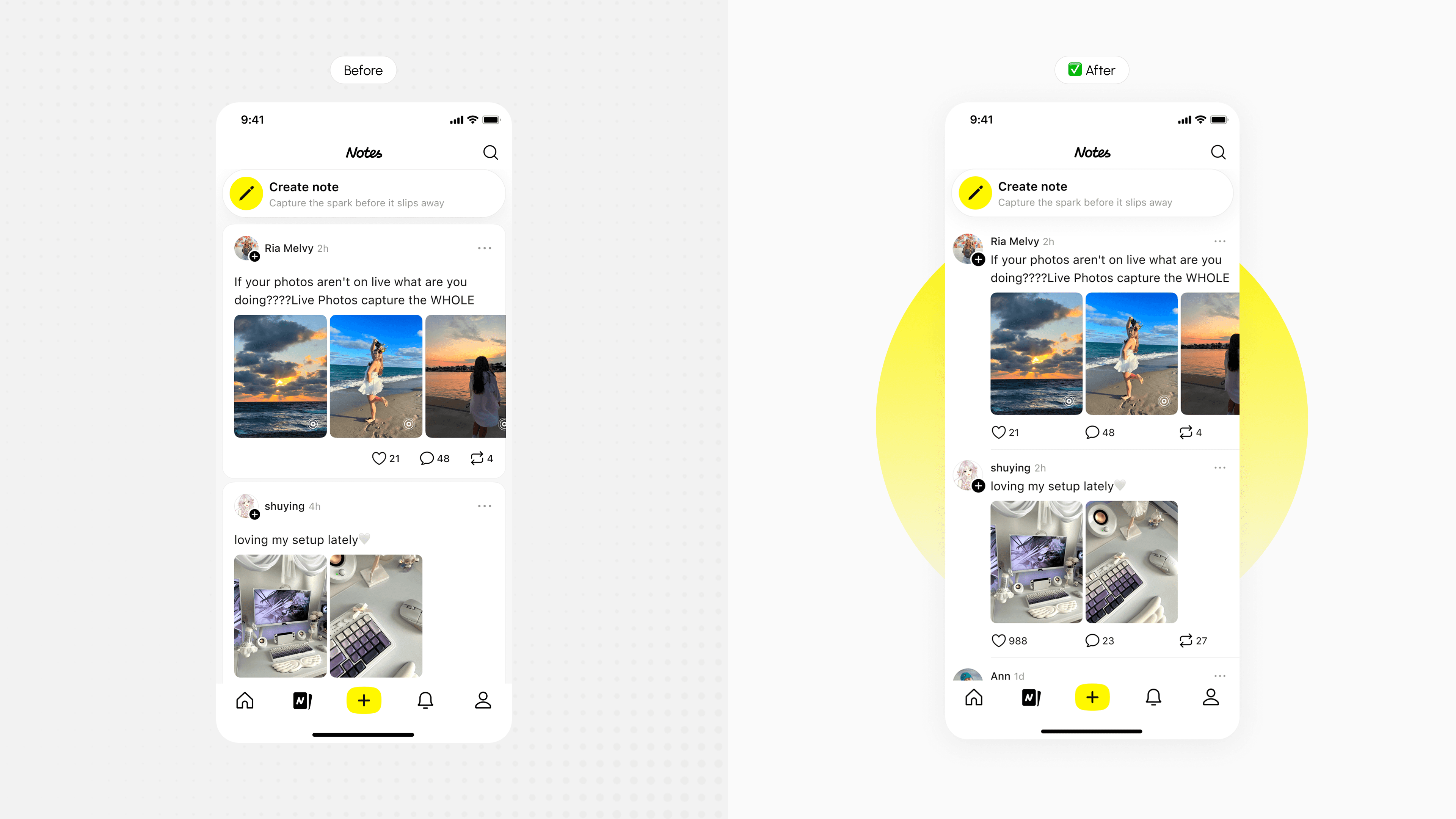
Profile information surfaced after users engaged with the content, making recognition feel natural rather than interruptive.
Follow rate and profile click-through both saw significant lifts.
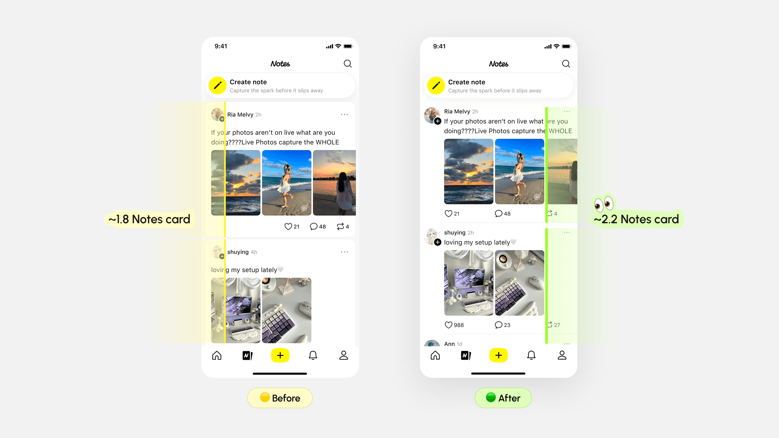
Tightening spacing between username, text, and media let more notes appear per screen without feeling cramped. More content visible at once means more chances to capture interest before someone leaves.
Spot a friend deep in the red and send them a virtual feed. It lands as a real notification — playful, warm, impossible to ignore.
Research & process
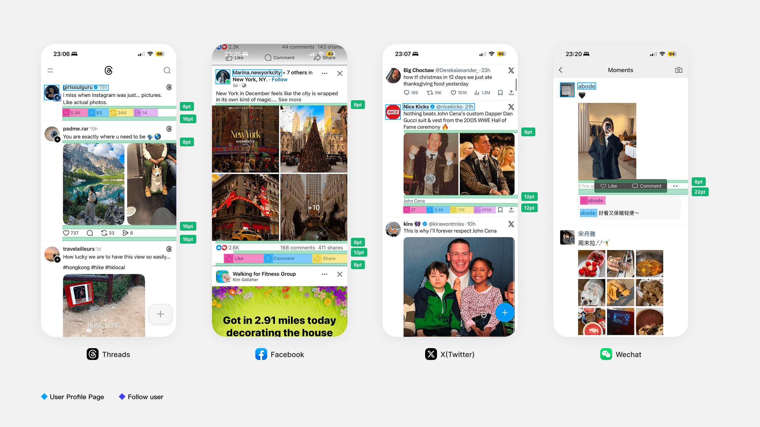
I looked at how they handled interaction bar alignment, profile placement, card padding, and content density across different post types.

I looked at how they handled interaction bar alignment, profile placement, card padding, and content density across different post types.
My Takeaways
Design changes often introduce trade-offs — and that's okay.
Running event-level analysis taught me to evaluate design not by how it looks in comparison, but by how it moves the metrics that matter. Every decision is a hypothesis.
Structured communication is a design skill.
In review settings, clarity of reasoning matters as much as quality of the work. I got better at leading with the logic — problem → decision → rationale — so conversations could go deeper instead of just covering ground.
Back