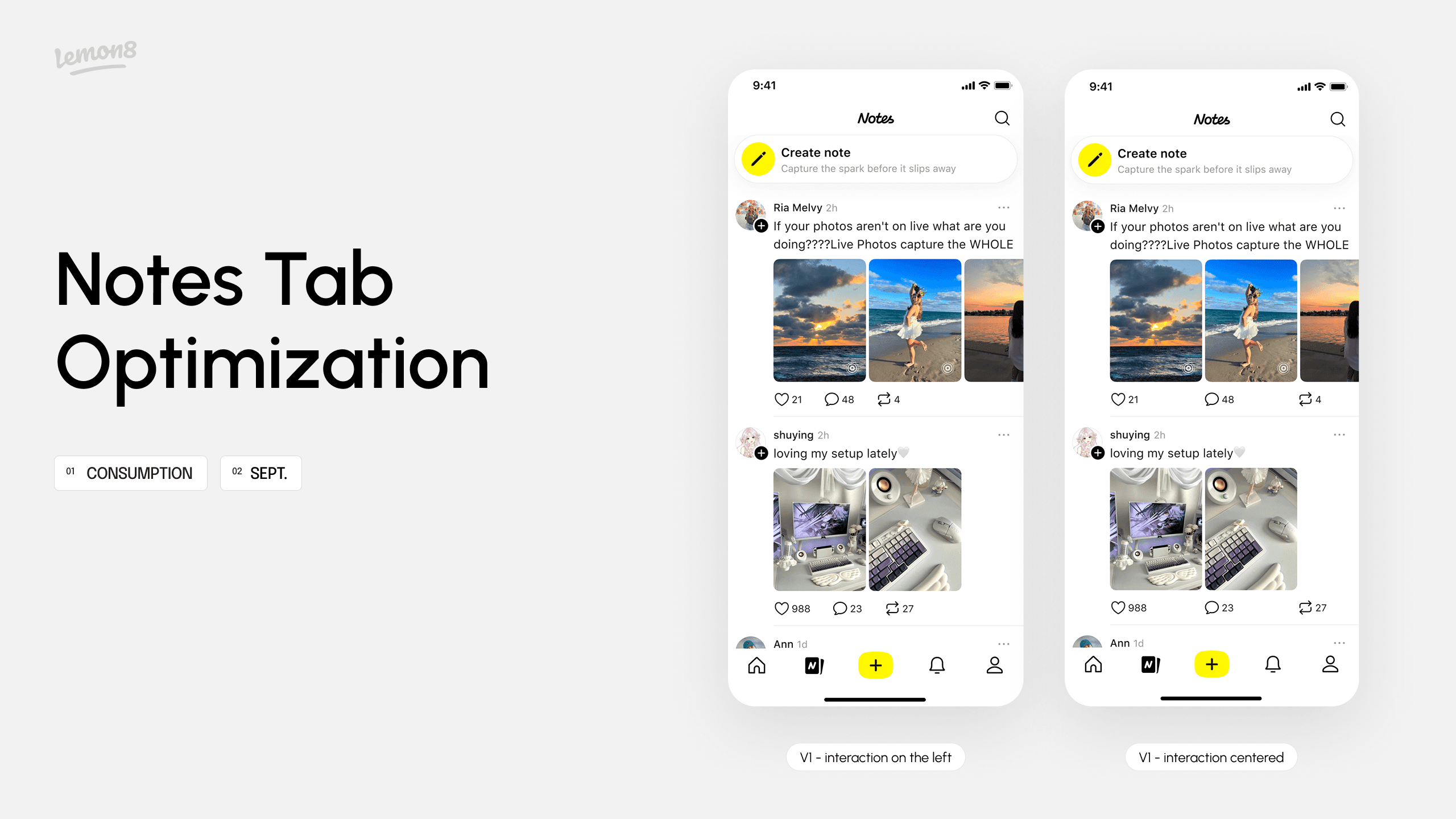
Lemon8 Notes Tab Optimization
Role
Product Designer Intern (Worked as the sole designer on this project)
Timeline
Aug-Sep 2025
Skills
Product thinking & strategy
Brainstorming
UI / UX Design
Tools
Figma
Background
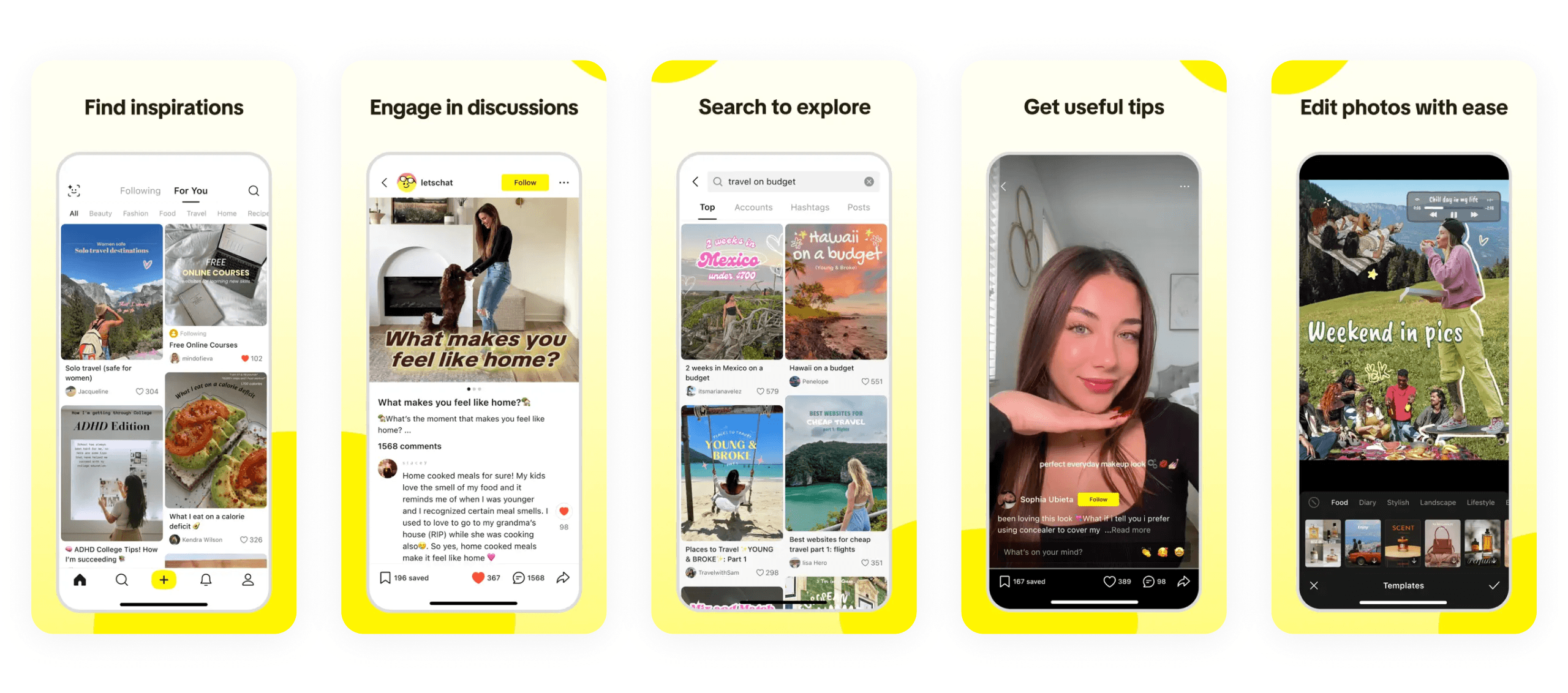
What is Lemon8?

A lifestyle community app powered by TikTok, where users can discover and share authentic content on a variety of topics such as beauty, fashion, travel, food, and more.
What is Notes?

A space for quick sharing of everyday thoughts and life, designed to encourage low-pressure expression and easy, entertaining browsing.


With the launch of Notes in early 2025, Lemon8 saw everyday sharing extend beyond creators, empowering even content-first users to participate and express themselves.

BUT after the initial wave of posting and sharing, retention within Notes began to decline 😫
The feed relies heavily on algorithms, if first few notes fail to capture the user's interest, they are likely to disengage…
💭
How might we attract more users to consume and engage with Notes content at first glance?
Understanding the Problem
To better understand the issue, I revisited the existing Notes layout, reviewed statistics on scroll down ratio, and analyzed on what causes the inefficiency…
Pain Points

1
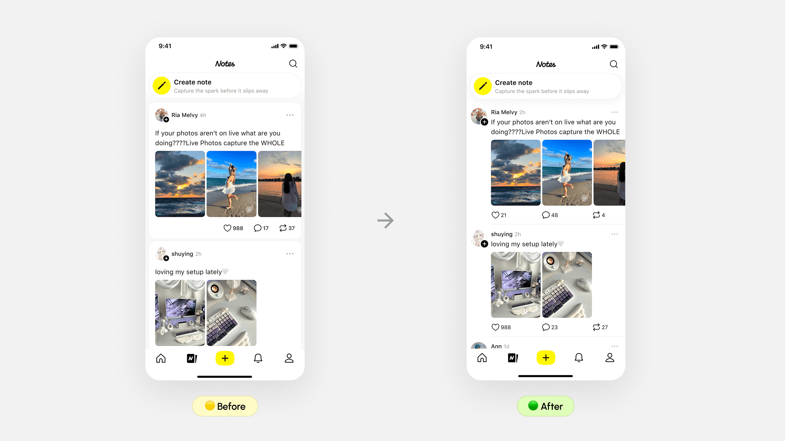
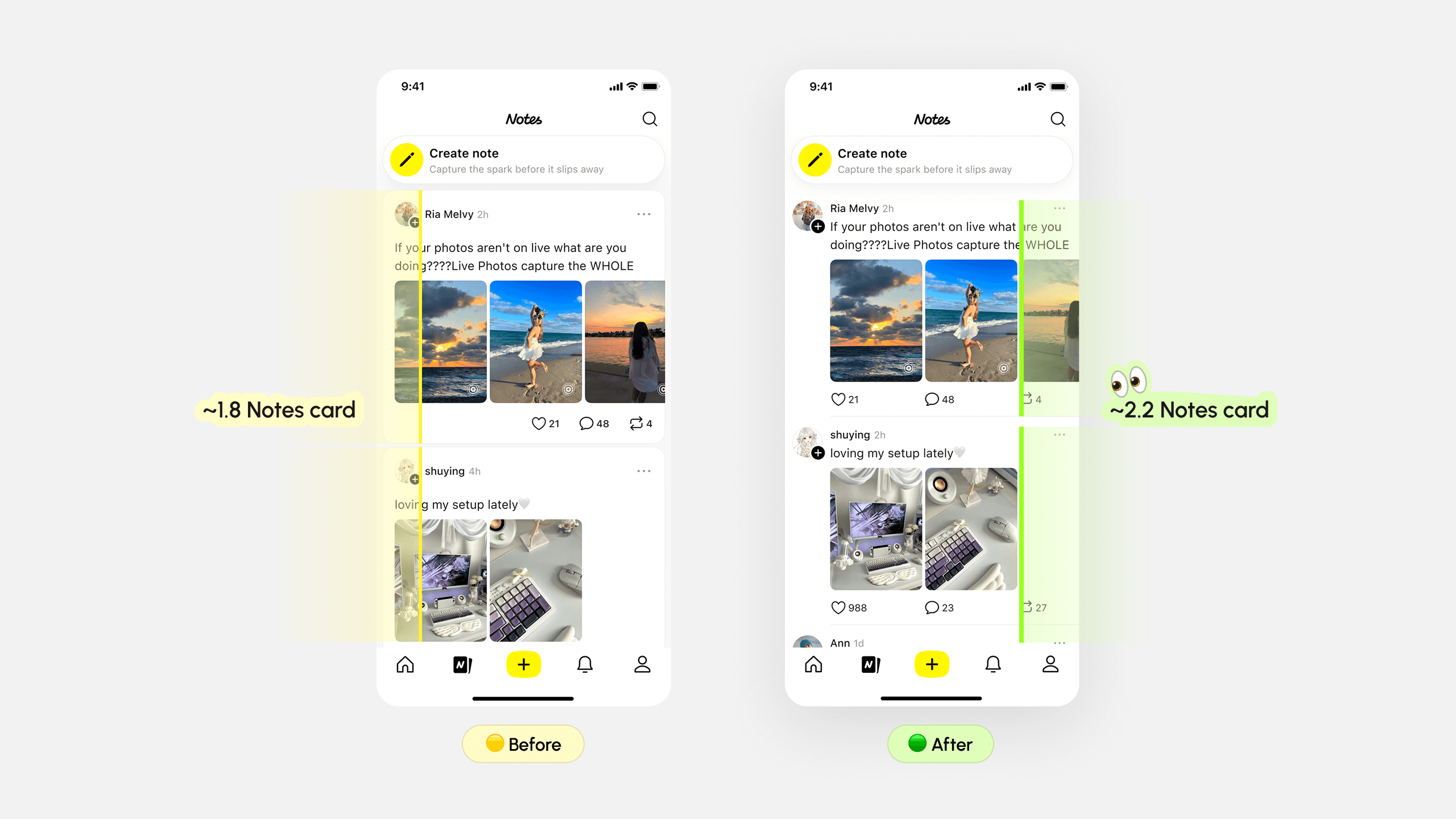
Only 1.5–2.5 notes per screen, limiting content exposure and slows browsing momentum.
2
Reading flow interrupted by author-centric information, shifting attention away from the content itself.
3
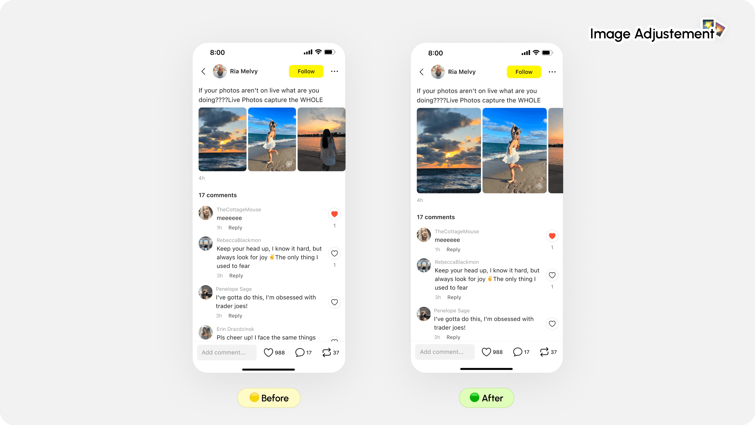
Detail page's image consumption is low, resulting in weaker engagement with visual content
Design Iteration Strategy
Design Showcase
Higher screen efficiency, increased user interactions
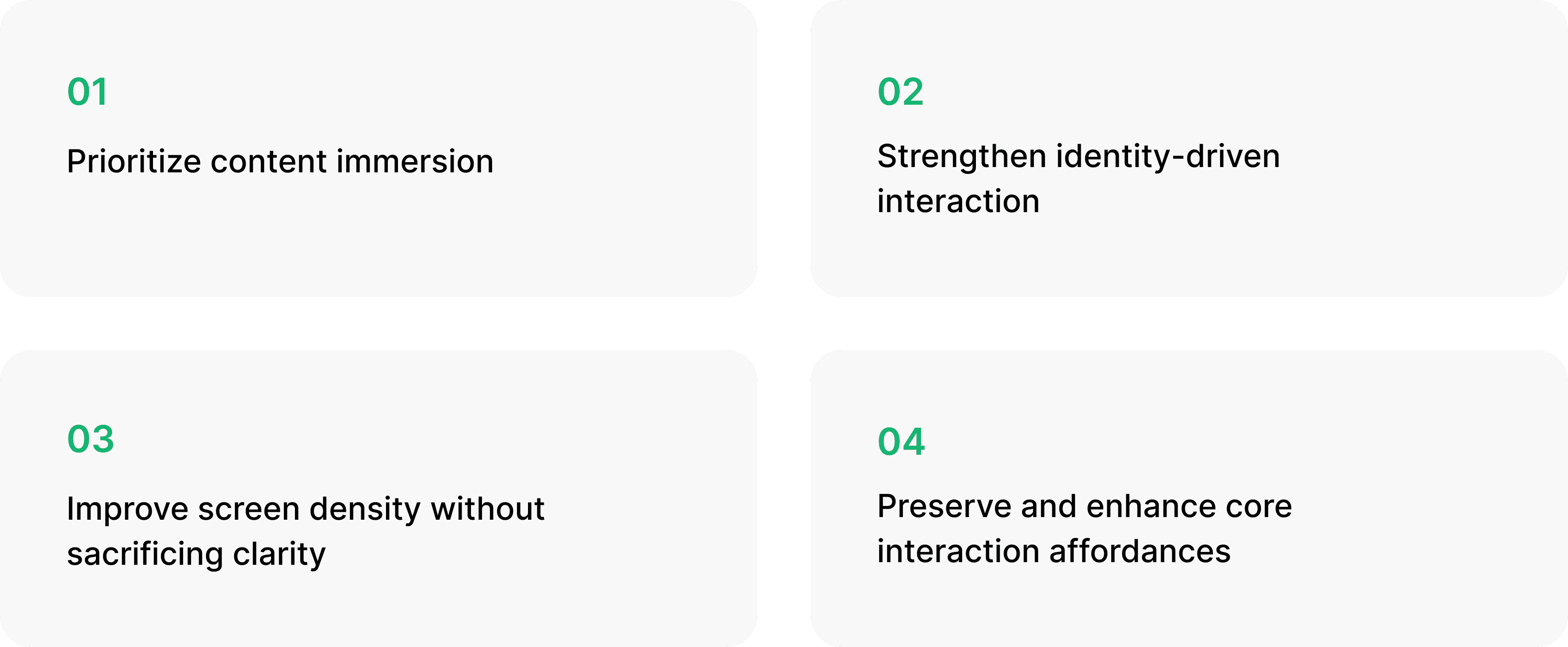
Key Solutions
01 Prioritize content immersion
Enlarging imagery to effortlessly increase preview area encouraged users to view the content better, allowing deeper exploration.
The improved design brought visual engagement and led to higher likes and reposts. Although comment interactions decreased slightly, the overall impact on content engagement was positive.
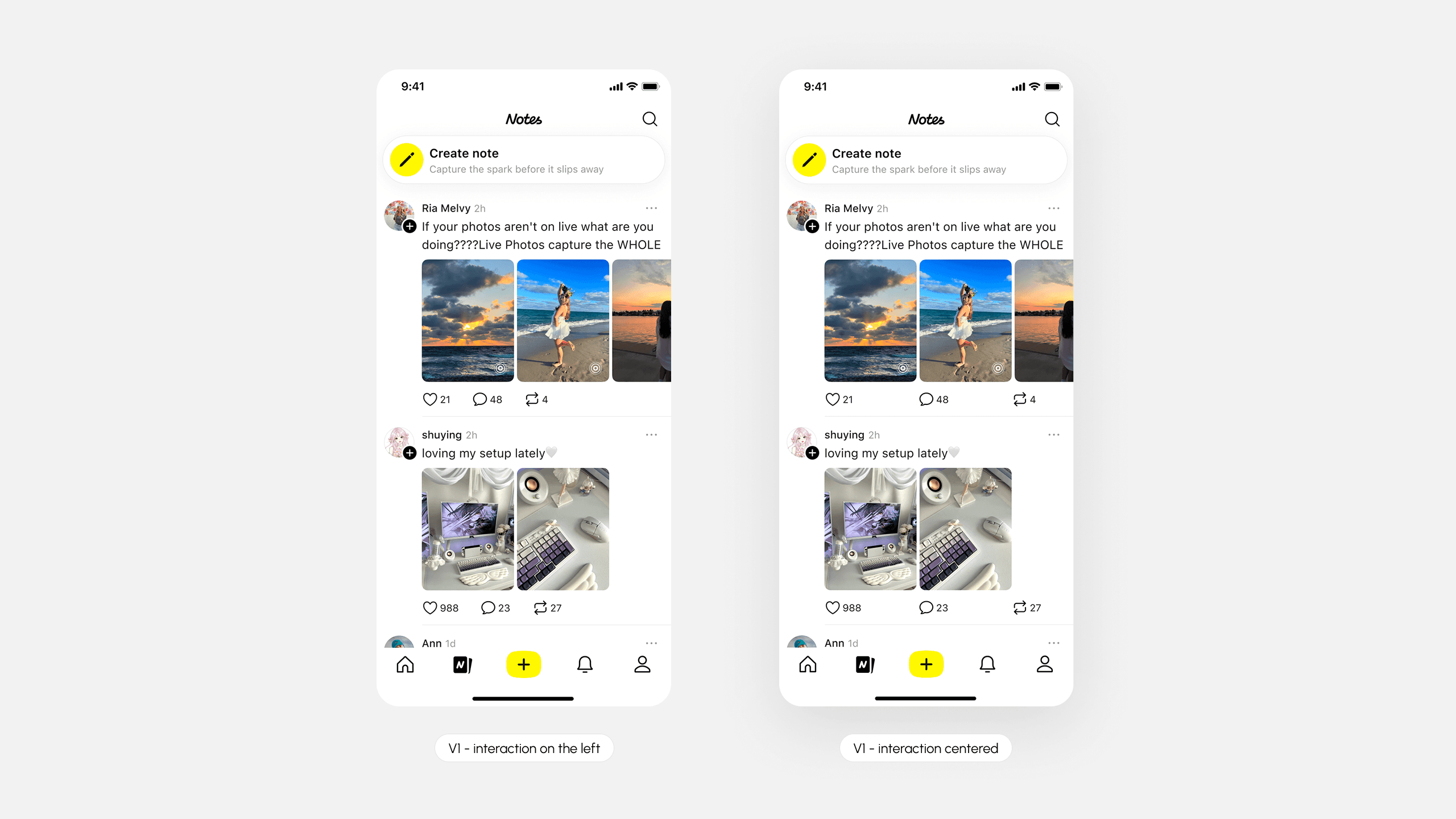
02 Strengthen identity-driven interaction
Reorganize profile placement to surface creator identity in the reading flow, reinforcing social presence and increasing interaction intent through clearer user recognition.
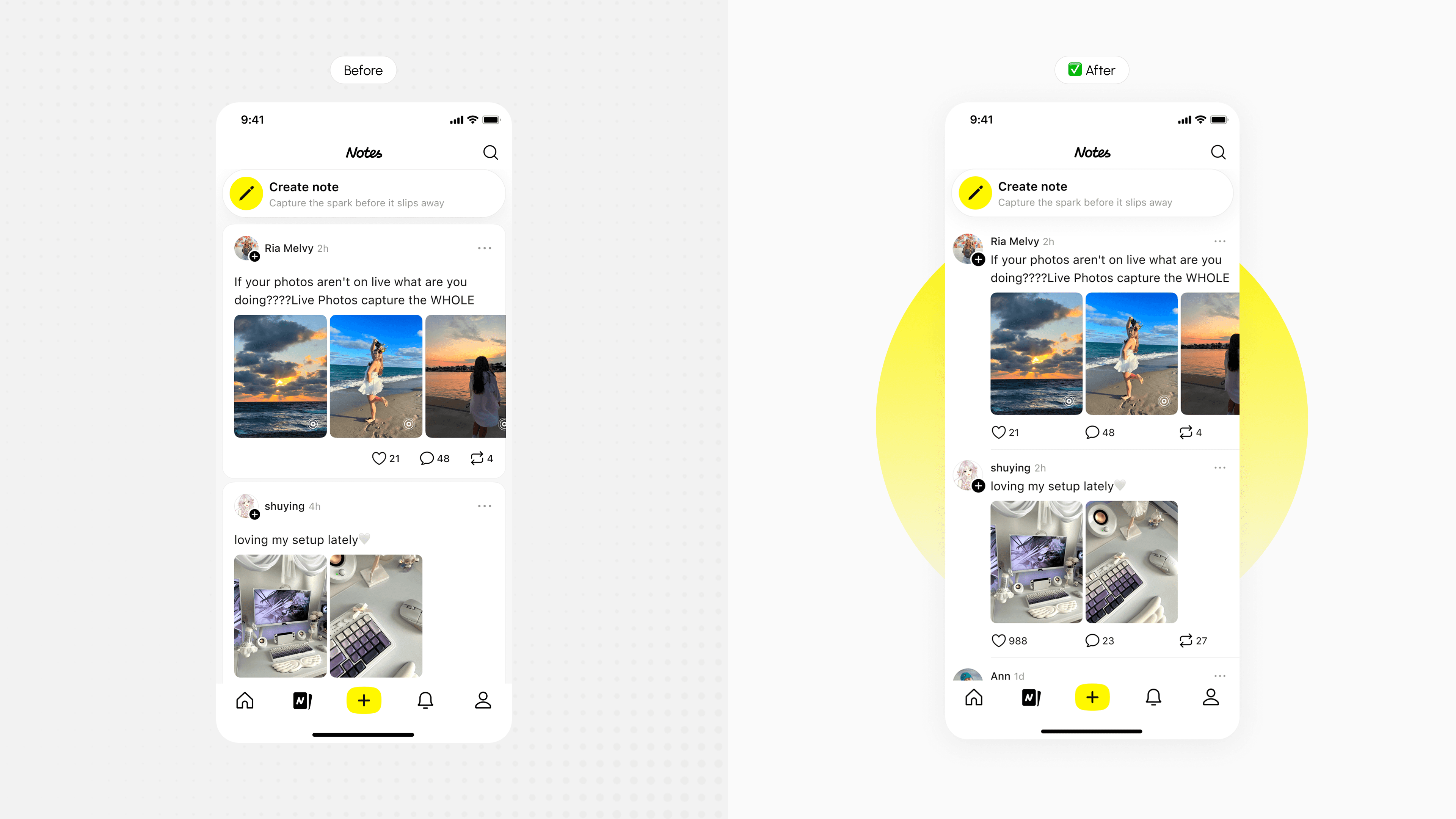
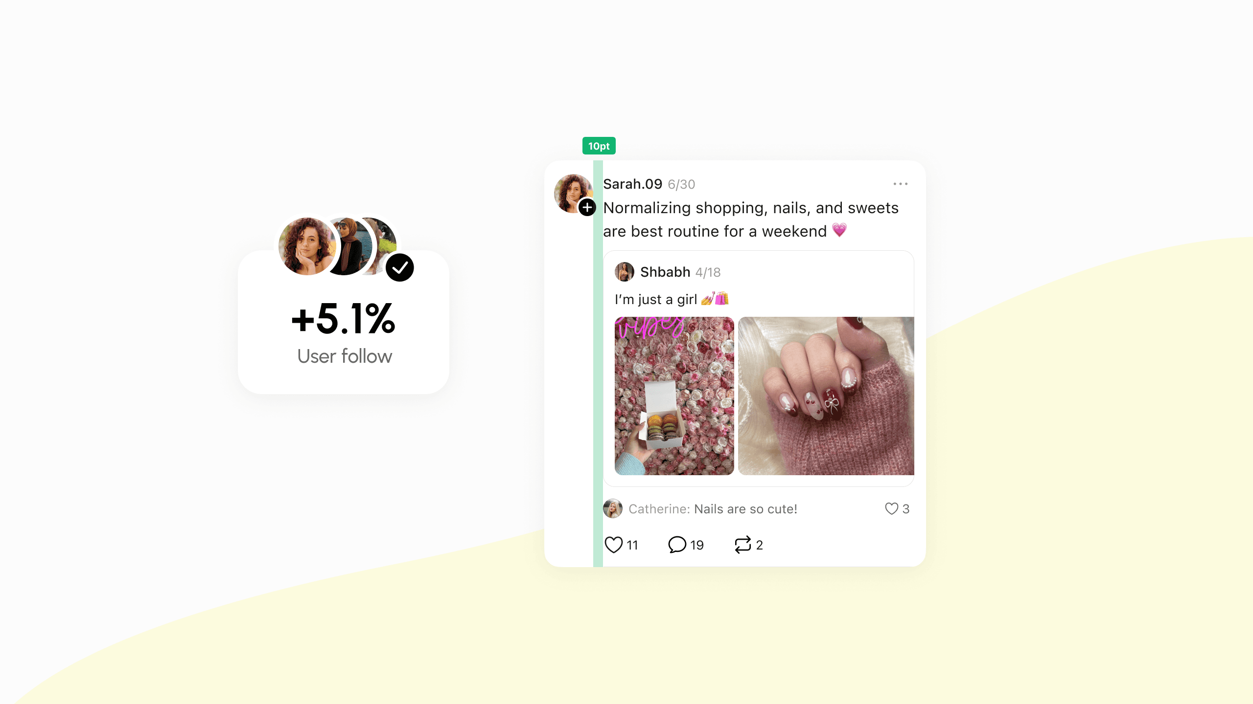
Significant lift in follow rate, and user profile click through rate, positively impacting overall Notes content consumption.
03 Prioritize content immersion
Adopt a flatter content structure by tightening spacing between key elements (username, text, media), allowing more content to appear per screen while maintaining readability.

04 Preserve & enhance interaction bar
Ensure layout optimizations do not weaken existing interaction behaviors (like, comment, share), and where possible, subtly reinforce clickability through clearer hierarchy and placement.
Both variants experienced small decreases ☹️ in likes and comments, while reposts increased slightly 1.29% in V2 compared to the controlled group.
Behind the Scenes
Multi-dimensional competitive analysis across 5+ leading products
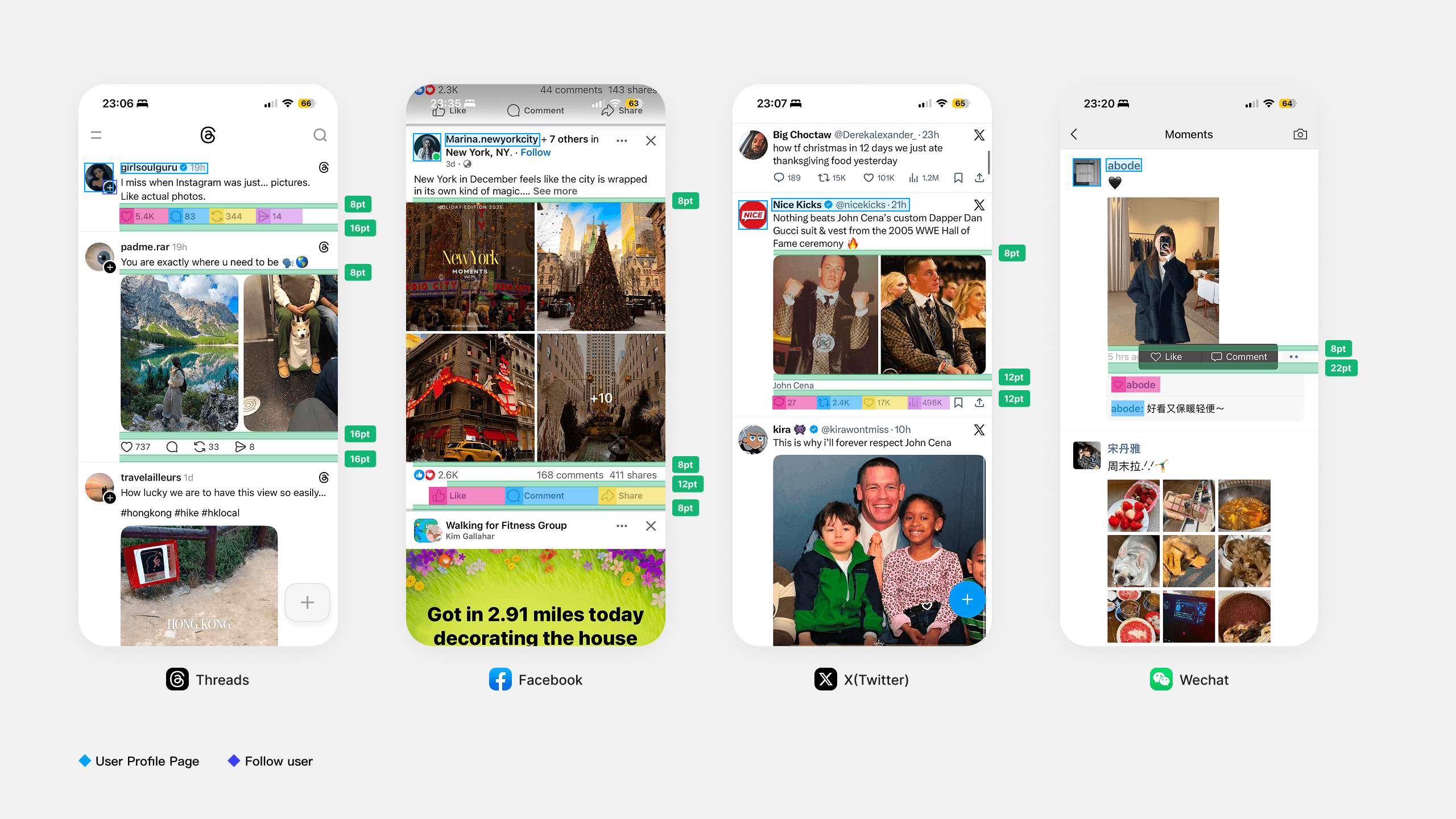
Card Padding
Identified scalable padding guidelines for multiple content layouts
Specs & Edge Cases

Additional Works
Other designs I did at Lemon8…
My Takeaways
Design changes often introduce trade-offs & shifts
Through hands-on experimentation, I learned to evaluate designs beyond UI comparison, using event-level data to understand impact, validate decisions, and guide future optimization. Along with skills of aligning potential changes to metrics of designing test groups with PMs in advances.
Structured communication & thinking
While presenting design ideas, I learned to focus on key points, articulate logic clearly, and aligning rationale with analysis. This improved both my decision-making and the clarity of my design explanations.
Be prepared in reviews to explain full context
Effective communication goes beyond presentation templates—it requires a clear understanding of the problem. Preparing context, logic, and updates ahead of reviews enabled more thoughtful responses, deeper discussion, and clearer decision-making.